Harvard Library Global Navigation
Performed a competitive analysis and card sort to improve the navigation of Harvard Library's primary web property.

At A Glance
Summary
As a UX & Discovery Intern with Harvard Library's User Research Center, I lead research to make library.harvard.edu's global navigation more intuitive for students and fledgling researchers.
Skills
Information architecture, Card sorting, Research synthesis, Competitive analysis
Role
User research, Project management
Tools
Optimal Workshop, Miro
Challenge
Problem Statement
The legacy navigation of Library.Harvard (library.harvard.edu) was implemented as part of a website redesign in 2018. Since then, many new elements and pages were added to the website. Additionally, responses to COVID-19 led to navigational quick-fixes. Based on a preliminary look at website analytics, the Library was concerned that the navigation was no longer meeting the needs of some of its core audiences, including graduate students and novice researchers. The goal of this research was to determine the best top-level global navigation labels and corresponding content groupings for Library.Harvard.
Research Questions
- How should Harvard Library organize its navigation to best help users complete common tasks?
- What relationships do users expect to exist between types of content?
- What terminology is best understood by users?
Solution
Proposed Navigation & Content Buckets
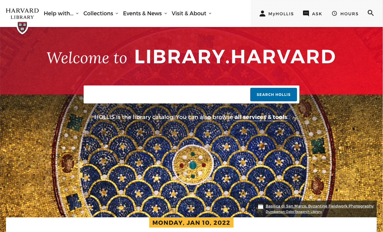
| Help with… | Collections | Events & News | Visit & About |
|---|---|---|---|
| All Services, Tools, and Catalogs | Explore all collections | Events | Hours & Locations |
| How to Guides (e.g. Borrowing, Alumni Access) | Search digital collections | News (Press Releases & Stories) | Find a Space |
| Research Guides | Exhibits | Visitor Access | |
| Staff Directory | |||
| About Harvard Library |
This navigation was implemented and is viewable at https://harvard.library.edu.
Process
Methodology
We began by conducting a landscape review with the full user research team as well as the communications lead, who was a key stakeholder in this process. After documenting trends from competitors—mainly other academic libraries at leading institutions as well as well-known public libraries and cultural institutions—we came together to brainstorm menu title ideas.
At this point, we determined a card sort was the next step:
- Remote, asynchronous card sort
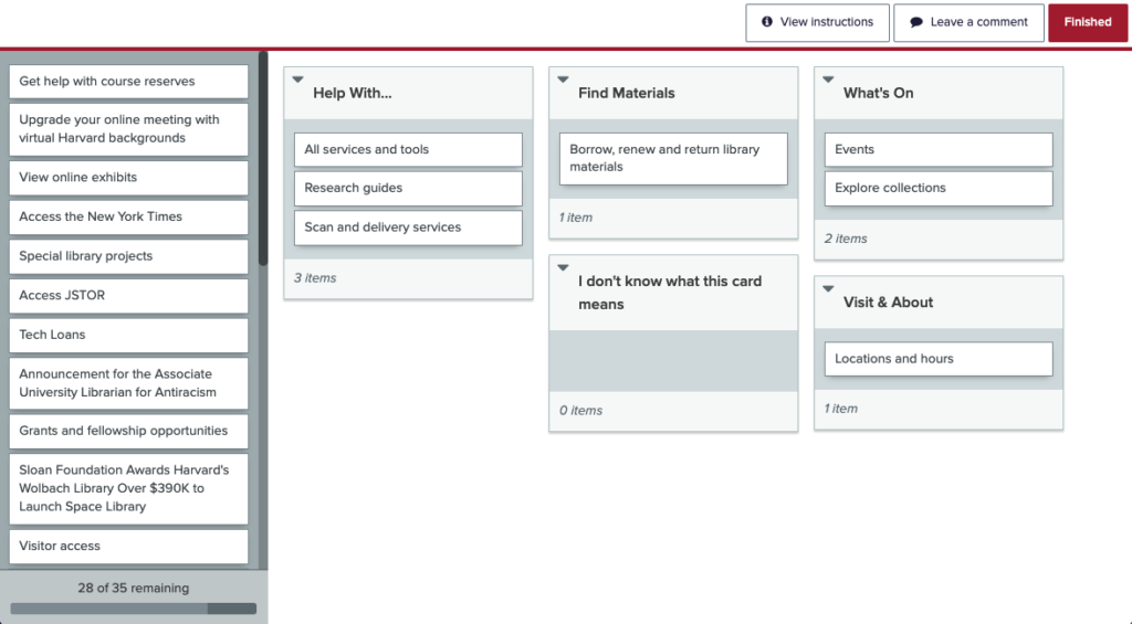
- Conducted in Optimal Workshop
- Included post-sort questionnaire
- Hybrid sort: 5 standard categories
While we had a solid understanding of the library brand and communication guidelines, we decided to keep the sort hybrid (with the option for users to add their own categories) to ensure that users were not placing cards in categories because they had no where else to put them. We started with 4 categories: “Help With…”, “Find Materials”, “What’s On”, and “Visit & About.” Then, we used Google Analytics data to determine the top 50 most-visited pages and created corresponding cards for the sort. We culled the cards by removing cards that were too similar to one another and edited card titles to prevent users from making decisions based on parallel sentence structure.
Before launching our sort, we conducted a pilot test with 4 former library interns who provided feedback that led us to adding a 5th category: “I don’t know what this card means.”

Target Population & Participants
We sent the card sort to the User Research Center’s email list of ~1000 students and recent graduates who have expressed interest in taking library surveys. We received 151 completed responses in 4 days and an additional 50 incomplete responses, which were not included in the analysis. Over 80% of participants were current students, and 60% identified as graduate students.
Analysis
To analyze the results, we used Optimal Workshop’s built in tools and conducted our own synthesis of the questionnaire responses. The most useful tool in Optimal Workshop was the standardization grid. From this grid, we were able to determine which cards had consensus among users and which cards seemed to be divided somewhat evenly among multiple categories.
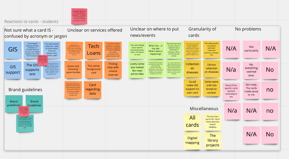
We created an affinity diagram in Miro to analyze the results of the questionnaire, which asked users about their reactions to specific cards and categories.

Card Sort Key Findings
- Participants easily understood the “Visit & About” category. There was consensus among participants about the content that should be included here, with “About”, “Locations & Hours” “Visitor Access” and “Find Staff Directory” all being placed here more than 80% of the time.
- Participants perceived an overlap between “Help With…” and “Find Materials. Several cards that referenced making requests or using services were split nearly equally between “Find Materials” and “Help With,” including information about borrowing and renewing library materials, scan and delivery services, and interlibrary loan requests.
- Participants did not easily understand “What’s On”. Participants did not seem to understand the What’s On category. We expected the press releases and stories to end up here, but these cards were least likely to be placed in the 4 standard categories and 19 of 32 (over half) of participants who created a new category included the words “news” or “announcements” in the category title. In the post-sort survey 42 of 61 respondents to the post-sort questionnaire said they found “What’s On” confusing.
- Jargon, abbreviations, and library-specific terminology were not well understood. Users were confused by often-used abbreviations and acronyms like GIS, HOLLIS, and JSTOR.
Top-Level Menu Recommendations Explained
Help with…
We decided to keep “Help With…” despite its slight ambiguity because by eliminating “Find Materials”, we think users will be able to discern that services, tools, and guides will be here. We suggest moving the “All services, tools, and catalogs” listing to the top of the sub-navigation because this content is most used.
Collections:
The “Collections” label will host all collections, projects and exhibits. It seemed that these 3 content types should be grouped together since users were not able to consistently discern the difference between an individual collection and an individual project or exhibit. Collections felt the most all encompassing. However, we recommend changing the label to “Collections & Exhibits” in the future, pending development time to ensure the character count works with site breakpoints to more explicitly convey the content.
Events & News
Users were unsure about the What’s On category, but we know it’s import for library communications to place prominence on new and upcoming features. We opted for the explicit labeling suggested by many participants via category creation or the post-survey questionnaire. Since users are more likely to scan the site looking for events, we thought this word should come first. We also suggested a menu item to link to recent exhibits here, since users might expect to find these with events.
Visit & About
This worked so well in the card sort that we decided to keep it as is. Since people are more likely to be looking for information about visiting than about the library’s mission or history, we kept “Visit” first in the menu title. To maintain consistency with sites in our landscape review, we suggest that this menu item be placed furthest to the right.